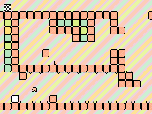
Today I spent most of my night (after homework of course) working on the art direction of mika-tika. Right now we have a very basic messy pixel style that I made about 2 years ago, but am not completely in love with.
We wanted to give the game some personality without getting too cliche or copying something else. We eventually decided to try the “arts-and-crafts” theme. I started by trying some water color effects, but they all looked a little to much like I just slapped a filter over the whole game. The only part I liked was the way the background looked.
For the next iteration I applied a canvas filter on the blocks, and I think it turned out a bit better, but it looks a little too rough to me.
At this point I decided to try something completely different and doodled mika-tika as a crayon drawing in paint. This was an interesting mock-up and I might look into it a bit more, but I am afraid it lacks creativity, and has been done to death.
I had not really liked any of the effect I had applied to the foreground objects, so for the next mock-up I tried only applying a subtle filter to the background. I liked this one, and may end up using it along with a general cleaning up of the foreground sprites.
I liked the previous design so I decided to take the more subtle filter a little bit further and see what it would look like over all the objects
Finally, I tried something very different, and put a texture on all of the blocks, but not the background. This made them look a bit weird, but I may be able to massage them in if I play with the colors a bit.
Overall, I was happy with the range of directions I was able to quickly mock up (even if they all were relatively low quality). I definitely see some options I might like to try out, and was wondering if anyone else would like to give some feedback or suggestions. Let me know which ideas you like!


Leave A Comment
You must be logged in to post a comment.